12 Unexpected Colour Combinations That Look Surprisingly Good Together
There is a lie doing the rounds and it goes like this. Some women just have an eye for colour, and if you were not born with it, you are stuck with navy.
Rubbish. Unexpected colour combinations are not magic and they are not taste. They follow reasons. Dull, learnable, slightly boring reasons that nobody bothers to explain because it is easier to sell you a capsule wardrobe in four shades of oatmeal.
I have been colour-analysing and styling women for years, and the number of times someone has told me she cannot wear colour while standing in front of me looking absolutely phenomenal in cobalt is now well past funny. She can wear colour. She has just never been told which colour, or what to put next to it.
So here are twelve combinations you would probably have called wrong, why each one works, and the easiest way to actually wear it. Not on a mood board. On a Tuesday.
Why you keep reaching for the same three combinations
Navy and white. Black and everything. Denim and a neutral.
You did not choose those. They chose you, over about twenty years of being gently told what is flattering, what is appropriate, what is safe for work, what will not draw attention. Every one of those words means the same thing. Take up less room.
And they do work. That is the trap. Nothing goes wrong when you wear navy and white. Nobody comments. Nobody looks. You get through the day unnoticed, which is exactly what you were trained to want.
I did it too. I stood in a Marks and Spencer changing room at 43 in another black top and did not recognise the woman looking back. Not because I looked old. Because I looked like nobody in particular.
Familiar is not the same as right. It is just the thing you have done most often.
What actually makes two unexpected colours work
Five things. You do not need to understand colour theory to use any of them, and I would rather you did not try, because half of what is online about colour theory is written for graphic designers and none of it accounts for the fact that clothes have to go on a body.
They are the same intensity. This is the big one. Hot pink and emerald work because both are shouting at the same volume. Hot pink and dusty sage do not, because one is shouting and one is whispering, and your eye reads that as a mistake rather than a decision. Match the volume and you can pair almost anything.
There is warm and cool tension. Two colours from opposite temperatures create a little friction, and friction is what makes an outfit interesting instead of coordinated. Cool turquoise against warm coral. Cool lilac against warm orange. It should feel slightly like they are arguing. That is the point.
One colour leads and one answers. Most combinations that look wrong are actually just 50/50 splits worn by someone who is not ready for a 50/50 split. Give one colour eighty per cent of the outfit and let the other one turn up as a bag, a shoe, a scarf. Same two colours. Completely different nerve required.
A print bridges them. If two colours feel too far apart, put something between them that contains both. A scarf, a printed blouse, a bag. Your eye sees the connection and stops objecting. This is also why pattern behaves like colour once you get going, but that is a whole other post.
One of them is a neutral you had not counted. Leopard is a neutral. Denim is a neutral. So is anything in a print busy enough that no single colour dominates. If you love leopard print, the answer is almost never less leopard print.
That is it. That is the entire system.
12 unexpected colour combinations to try
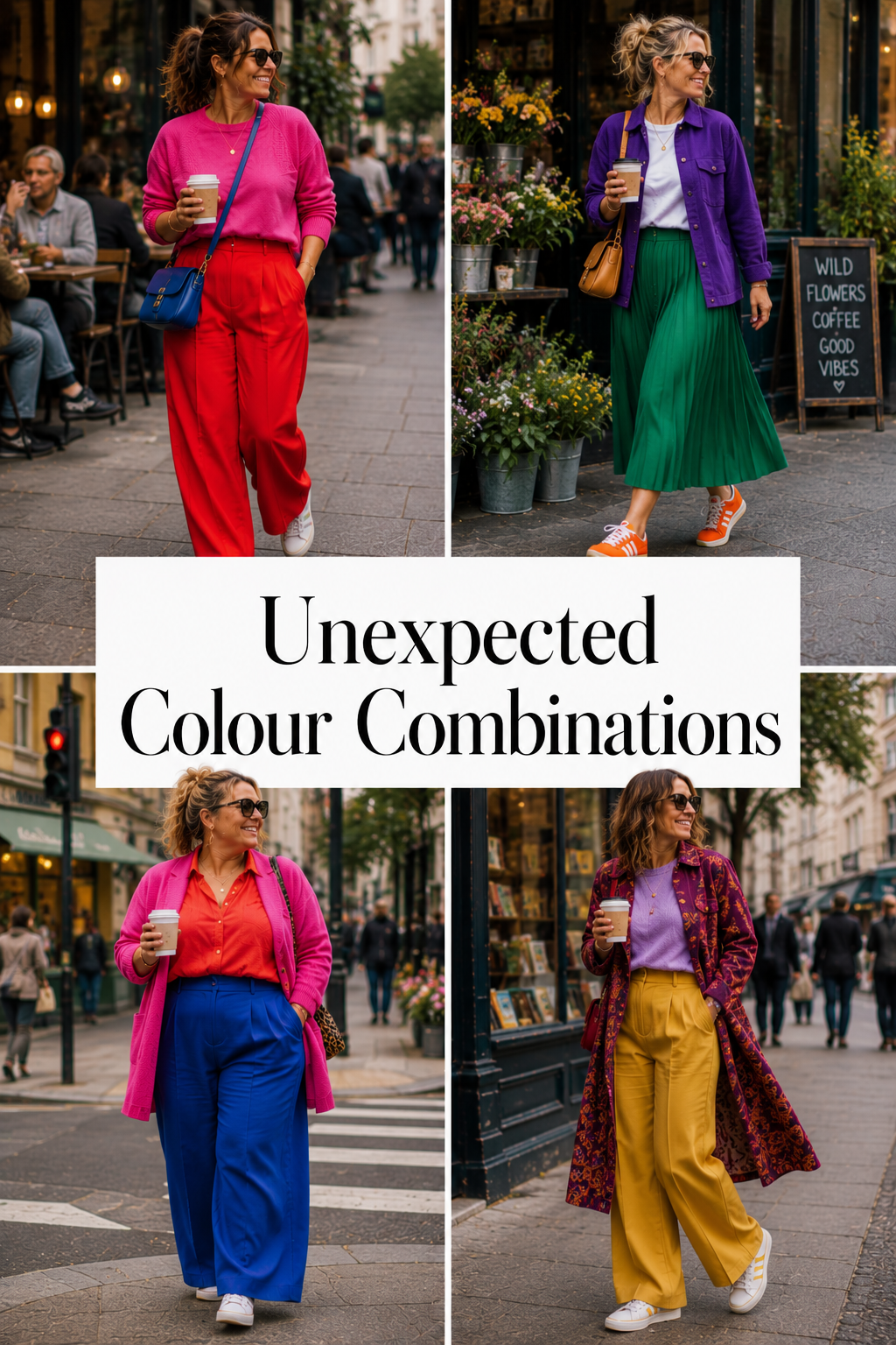
Pink and red
The one everybody was told not to do, and the one that looks the most expensive when you do it. It works because pink is just red with the volume turned down, so you are not clashing two colours at all, you are wearing one colour at two different strengths. Same heat, different levels. Nothing to fight about.
Easiest way in: a red knit with pink trousers, or a pink top under a red coat. If that feels like a lot on day one, wear the red and put pink on your lips. Yes, that counts. Start where you can stand it.
Cobalt and orange
True opposites, and the pairing that makes people stop you in the street. Cobalt is a deep, cold blue and orange is loud and warm, so the contrast is at maximum on both temperature and hue. There is nowhere for your eye to rest, which is why it reads as deliberate rather than accidental.
Easiest way in: cobalt trousers with a tan or rust top, working up to full orange as you get braver. An orange bag against a cobalt dress does most of the work for almost no risk.
Emerald and hot pink
Deep, saturated green against deep, saturated pink. Both jewel tones, both at full strength, and neither one backs down. This is the combination that looks like money, which is why fashion houses use it every other season and then act like they invented it.
Easiest way in: an emerald blazer over a hot pink tee with jeans. Add gold jewellery. Gold sits between the two and calms nothing down, which is exactly what you want.
Purple and mustard
Nearly opposite on the wheel, but mustard is a yellow that has been knocked back with brown, so it does not scream the way pure yellow would. That mutedness is what lets purple go deep and dramatic without the pair tipping into fancy dress.
Easiest way in: mustard trousers with a purple knit. If you already own a mustard coat, put a purple scarf in the pocket and see what happens.
Turquoise and coral
Cool sea, warm shell. Both sit at the same medium intensity, which is why this one feels friendly rather than confrontational. It is the combination that reads as holiday even in February, and that is not a criticism.
Easiest way in: a turquoise top with coral earrings or a coral bag. Reverse it in summer, coral dress and turquoise sandals.
Burgundy and pale blue
The unexpected one on this list. Burgundy usually gets partnered with cream or camel and left there. Put it against a pale, cold blue instead and the burgundy suddenly looks like a decision rather than a default. The contrast is in depth, not in hue. One is heavy, one is barely there.
Easiest way in: a pale blue shirt under a burgundy jumper. Genuinely that simple, and it works for work.
Lilac and orange
Cool pale purple against hot orange. This should not work and it absolutely does, because lilac is quiet enough to let orange be the loud one without disappearing entirely. Dominance is doing all the heavy lifting here, so keep the proportions uneven.
Easiest way in: a lilac dress or knit with an orange bag or shoe. Do not go 50/50 on this one until you have worn it twice.
Green and purple
Nature does this constantly and nobody argues with a lavender field. Both are secondary colours, both sit in the same middle band of the wheel, so they share more than you would expect. The trick is picking versions that are equally deep. Forest and aubergine. Grass and violet.
Easiest way in: a green coat over a purple dress. Or purple trousers, green knit, and a leopard shoe to bridge them.
Yellow and cobalt
The loudest pair here. Both primary, both at full strength, no compromise anywhere. This is the combination that gets photographed. It is also the one most likely to make you feel like you are wearing a football strip if you get the proportions wrong, so put the yellow in the smaller role first.
Easiest way in: cobalt everything, yellow bag. Then cobalt trousers and a yellow knit once you have seen how it looks on you.
Raspberry and turquoise
Two jewel tones at identical intensity, one warm and one cold. The saturation match is what makes it hold together. Neither is trying to be a background colour, so the outfit reads as two statements standing next to each other rather than one statement and one apology.
Easiest way in: raspberry knit, turquoise earrings, and build from there.
Red and pale pink
Same family, opposite ends. Red is dense and pale pink is almost white, so you get all the contrast of light against dark with none of the risk of two colours fighting. This is the softest entry point on the whole list and the one I would give you if you have not worn colour since 2019.
Easiest way in: a red skirt with a pale pink shirt. Nude or tan shoes. Nothing else needs to happen.
Teal and chartreuse
The acid pair, and the most modern-looking thing on this list. Both contain yellow and blue in different proportions, so they are technically neighbours, which is why they sit together instead of clashing. But chartreuse is so sharp that it creates tension anyway. Sophisticated and slightly rude, which is my favourite combination of adjectives.
Easiest way in: a teal dress with a chartreuse bag. Or a chartreuse knit with teal trousers if you are already having a good day.
The easiest way to wear a combination you have never worn
You do not go from navy and white to yellow and cobalt in one morning. Nobody does. Here is the actual sequence.
Start with the colour you already own and already wear. Not the exciting one. The one hanging in your wardrobe right now with wear on the elbows.
Bring the second colour in small. A bag. A shoe. A scarf. Lipstick counts. Earrings count. You are testing whether you can stand the sight of it on you, and a bag is a very cheap way to find out.
Then reverse the proportions. Wear the second colour as the main event and let the first one turn up as the accessory. Same pair, and it will feel like a completely different outfit, because it is.
Then go 50/50. By this point you have worn both colours together three times and nobody has died. The clash stops being a leap and starts being a Tuesday.
If you would rather skip the ramp and just be given the exact formulas, I have written those out separately.
Shop your own wardrobe before you buy anything
Almost nobody needs a new wardrobe. Most women need permission and a bed.
Here is the ten minute version. Pull everything out and sort it into colour families. Not outfits, not seasons. Colour. Pinks together, blues together, greens together, and one pile for whatever has a print.
Now put things next to each other that you have never put next to each other. The burgundy jumper against the pale blue shirt. The green coat over the purple dress. You are looking for possibility, not a finished outfit, so do not get precious about whether the shapes work yet.
Photograph the combinations that make you stop. Your phone will show you things your brain will not, because your brain has twenty years of opinions and the camera has none.
You will find three or four pairings you already own and have never once worn together. That is the whole exercise. It costs nothing and it usually beats a shopping trip.
Your Colour Rebel challenge
Pick one combination from this list. One you would previously have said does not go.
Wear it this week. Not to something important. To the school run, to the supermarket, to your desk. Somewhere with low stakes and a mirror.
Then notice what actually happens, because it is never what you expect. Nobody stops you in the street to tell you it does not go. What happens instead is that you catch yourself in a shop window and you look like somebody. That is the bit worth chasing.
You were not born with a bad eye for colour. You were trained out of using it.
Find out which version of each colour is actually yours
Every combination on this list has a version that suits you and a version that drains you. Emerald and hot pink is not one thing, it is about forty things, and the difference between the one that lights up your face and the one that makes you look tired is a couple of degrees of warmth.
That is what colour analysis is for. Not to give you rules. To hand you your actual palette so you stop guessing in changing rooms.
Start with the free style quiz. It takes two minutes and it will tell you which direction to head in before you spend a penny.
Colourfully Rebellious.