How to Mix Patterns Without Looking Like You Got Dressed in the Dark
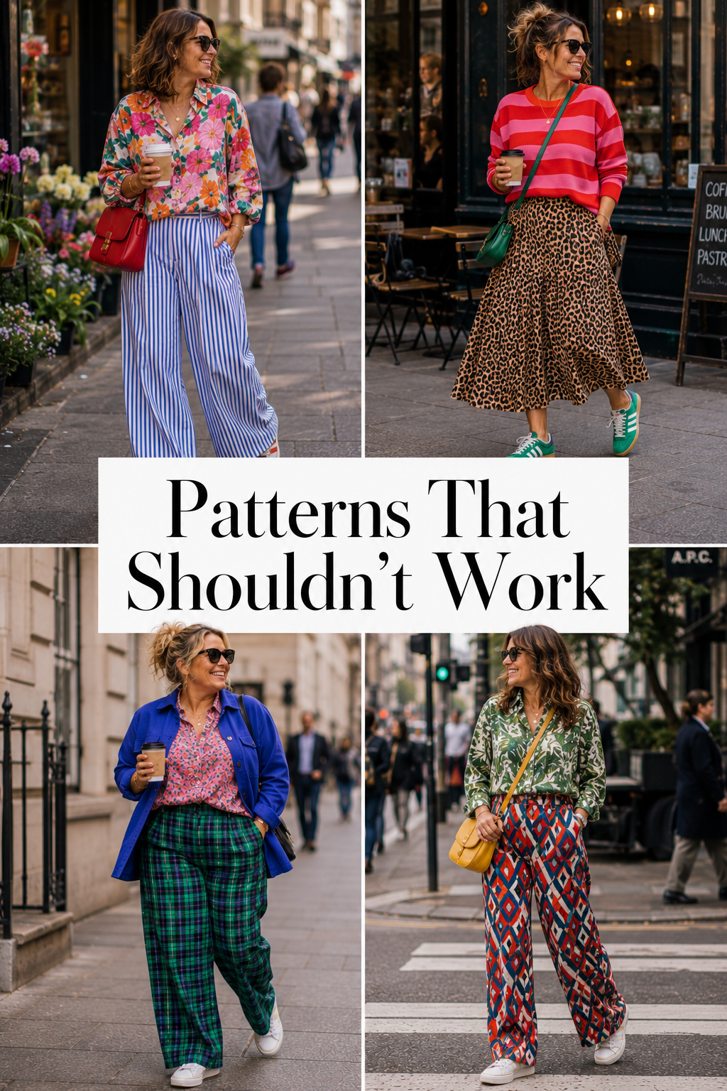
Somewhere along the way you were told that patterns need to match. They do not. That instruction has been wrecking outfits for about forty years and it is the reason most women own five printed things and wear them one at a time, always with something plain, forever.
Pattern mixing looks like the advanced class. It is not. It is four rules, and once you know them you will start seeing them everywhere, in shop windows, on the woman in front of you in the coffee queue, in every interiors magazine you have ever flicked through.
I am a qualified colour analyst and I have styled hundreds of women, and I can tell you that almost nobody who says "I can't mix prints" has actually tried. They have imagined trying, decided it would look mad, and put the plain black jumper back on.
My house is a print clash. Every room of it. Nobody has ever walked in and told me the wallpaper is fighting the sofa, because it is not, because the same four rules apply to a room as to an outfit.
Yes, stripes and florals go together
Let us get the big one out of the way, because it is the question I get asked most.
Stripes and florals is not a risky combination. It is the training-wheels combination. It is the one you do first, because it works almost automatically, and here is why. A stripe is a straight line repeating. A floral is a curve repeating. They are so different that your eye reads them as two separate things instead of trying to reconcile them.
That is the actual secret and it flips the whole thing on its head. Most women fail at pattern mixing because they are trying to make the two prints match. Matching is the wrong goal. You are not looking for prints that agree with each other. You are looking for prints that are different enough not to compete, with one thread of connection so the outfit still reads as one decision.
Different, plus one connection. That is the whole formula.
The four rules that do all the work
Change the scale
If you take one thing from this post, take this.
Two prints of the same size will fight. A medium floral against a medium geometric is visual noise, because your eye cannot decide which one to look at, so it gives up and reads the whole thing as a mess.
Make one big and one small. An enormous blowsy floral against a narrow pinstripe. A wide check against a tiny ditsy print. The size difference creates a hierarchy, and hierarchy is what your eye needs to relax.
Big and small. That is it. This one rule fixes about seventy per cent of pattern mixing that has gone wrong.
Find one colour friend
Two prints that share a single colour will read as intentional even if they have nothing else in common.
A navy and white stripe next to a floral that has navy somewhere in it. A red check next to a print with a red stem running through it. The shared colour acts as a handshake between them. Your brain spots it, decides somebody meant this, and stops objecting.
The shared colour does not have to be dominant in either print. It just has to be there. This is also why pattern behaves exactly like colour once you start playing, and why the colour post is worth reading alongside this one.
Let one print lead
You do not wear two heroes. You wear a hero and a supporting act.
Pick which print is the loud one. Give it the biggest piece of real estate, the dress, the skirt, the coat. Then let the second print turn up in a smaller role, a shoe, a bag, a scarf, a cuff showing under a sleeve.
Roughly seventy thirty is the ratio that never looks like an accident. Fifty fifty is a level four move and we will get to that.
Use your pattern neutrals
Here is the thing almost nobody tells you. Some prints behave like plain colours.
Leopard. Stripes. Checks. Spots.
Your eye has seen these so many times that it reads them as texture rather than as a competing pattern. Which means they will go with almost anything, and it means a leopard shoe is doing the same job in an outfit that a black shoe was doing, except it is far more interesting.
Leopard is the strongest of the four. If you love leopard print, the answer is almost never less leopard print.
Worth knowing why this happens, because it tells you which other prints you can promote to neutral status. Familiarity is the whole mechanism. Your eye stops processing a print as information once it has seen it ten thousand times, and starts processing it as surface, the way it treats denim or a cable knit. Which means the list is not fixed. Gingham is halfway there. So is a small ditsy floral. If a print is everywhere and nobody comments on it any more, you can treat it as a neutral and build on top of it.
Six pattern combinations to start with
Stripe and floral
The easiest one there is. A straight line against a curved one, so there is no competition to resolve. Works in every season, at every level of boldness, in every shape of outfit.
How to wear it: a striped top with a floral skirt. Keep the stripe narrow if the floral is big, and go wide on the stripe if the floral is small and busy. Bonus points if the floral contains a colour from the stripe.
Leopard and almost anything
Leopard is a neutral wearing a costume. It contains cream, tan, gold and black, which means it already shares a colour with most things in your wardrobe, and the shared colour rule takes care of itself.
How to wear it: a leopard shoe or bag with anything printed. Then a leopard coat over a floral dress. Then, when you are ready, leopard trousers with a striped top, which is the outfit that will get you stopped in the street.
Check and floral
Structured against organic, and one of the smartest looking combinations on this list. Check brings order, floral brings movement, and the contrast between them reads as deliberate rather than chaotic.
How to wear it: a check blazer over a floral dress is the safest entry, and it works straight into an office. A check skirt with a floral blouse is the braver version. Keep the checks and the flowers at different sizes.
Stripe and leopard
Two pattern neutrals together, which sounds like it should be too much and is actually one of the most wearable clashes you can do. The stripe brings direction, the leopard brings texture, and neither of them is trying to be the main event.
How to wear it: a black and cream striped top with a leopard skirt. Or the reverse, leopard top and striped trousers. Add red somewhere for the version that looks like you know what you are doing.
Spot and floral
Both are round, both are scattered, so the connection is already built in. The scale rule is doing all the work here, so get it right. A large spot with a tiny floral, or a tiny spot with a huge floral. Never two mediums.
How to wear it: a polka dot shirt under a floral pinafore. A spotted scarf with a floral coat. This is the most classically pretty combination on the list and it will feel the least frightening.
Geometric and organic
The grown-up one. A hard-edged repeating shape, chevrons, tiles, an abstract grid, against something that flows, a watercolour print or a loose botanical.
How to wear it: a geometric bag or scarf against an organic print dress. This is the combination that looks the most modern, and it is worth building up to, because it needs the scale and colour rules working together rather than one carrying the other.
When pattern mixing actually does go wrong
It does sometimes. Here is what has actually happened, and none of the reasons are your age. Nobody has ever looked at an outfit and thought "that would work on a younger woman". They think it looks busy, or they think it looks brilliant, and age has nothing to do with which one.
The scales are identical. Two medium prints, same size, same energy, competing for the same job. This is the most common failure by a distance and it is fixed by changing one of them.
Everything is shouting at the same volume. No hero, no support. Two enormous prints in two saturated colours, both demanding attention. Pick one to lead.
There is nowhere for your eye to rest. Three or four prints with no plain surface anywhere in the outfit, not even a bag or a shoe. A small patch of solid colour does a lot of work.
There are too many focal points. A statement print, a statement necklace, a statement bag, statement shoes. Every one of those is asking to be looked at first. Something has to be the second thing you notice.
That is the list. Four fixable problems, and not one of them is you.
Notice what is not on it. Not your size. Not your height. Not how long you have owned the thing or whether it is still in season. Every real pattern mixing failure is a mechanical problem with a mechanical fix, and every one of them takes about ninety seconds to sort out in front of a mirror.
The four levels, from scarf to full clash
Nobody starts at full clash. Here is the ramp.
Level one. A patterned scarf with a striped top. The scarf is small, removable, and can be taken off in the car park if you lose your nerve. This is the lowest-stakes pattern mix in existence and it still counts.
Level two. A leopard shoe or bag with a patterned dress. You are now wearing two prints in public and nothing has gone wrong. Note that carefully, because your brain will try to tell you afterwards that it was risky.
Level three. A patterned skirt with a different patterned blouse. This is the real one. Two proper prints, two proper pieces, roughly seventy thirty. Use the scale rule and the colour friend rule together and it will hold.
Level four. The full glorious clash. Fifty fifty, two heroes, and a third print in the accessories if you are really going for it. This is not a graduation and you do not have to reach it. Some women live at level two forever and look fantastic. But it is there, and it is more fun than anyone admits.
Your wardrobe challenge
Find the busiest patterned thing you own. The one you love and hardly wear because you can never work out what goes with it.
Now do not reach for the plain coordinate. You have done that every time so far and it is why the item lives at the back.
Instead, put it against every other print you own. All of them. The striped top, the leopard shoe, the check blazer, the spotted scarf, the floral thing you bought in 2019 and wore once. Lay them out on the bed, put them next to each other, and photograph every combination.
Your phone will show you things your brain will not, because your brain has decades of opinions and the camera has none. Do not judge as you go. Judge afterwards, from the photos.
You will find at least two combinations you already own and would never have tried. That is the whole exercise, and it costs nothing.
Start with the colours, then the prints
Here is the honest order of operations. Pattern mixing gets dramatically easier once you know which colours actually suit you, because then the colour friend rule stops being guesswork. You already know your reds. You already know your pinks. You are matching within a palette you trust instead of hoping.
Somebody handed you the rule that prints have to match, and you have been carrying it around ever since without ever checking who wrote it.
Start with the free style quiz. Two minutes, and it points you at the right direction before you spend a penny on anything.
Colourfully Rebellious.